How does one create a solid, impactful brand visual which translates and stands for the company values and essence?
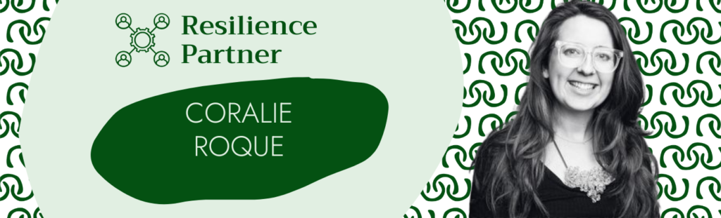
In the spotlight is Coralie Roque or Coco as I call her. Coco is the strategic left brain behind ‘The Resilience Mentor’s brand visuals. I am proud to have her as one of my resilience partners. Coco is the visual design wizard.
Coralie embodies business-oriented creativity. She produces intelligent design that benefits the growth of businesses. She translates businesses’ positioning and brand strategies into impactful and rich visual identities – making brands become unforgettable!
I am sharing the content of a nice chat I had with Coco, recently.
Nina: When I envisioned my brand, I wanted the brand visual which embodies “Creativity, Humanity and Philosophy and Business Science”. How did you magically meet my expectation especially in designing the submark?
Coco: Each shape, colour and typeface has a personality, gives us a certain feeling. So, with the best combination of shapes, colours and typefaces, we can translate whatever we want the viewer to feel. In the case of The Resilience Mentor, we used orange for creativity, red for Nina’s Malaysian roots but also to represent Nina’s energy and dynamism.
We used round shapes with a handmade touch for the human side and to add softness. We also added the sharpness with the black and the selection of typefaces.
Nina : How and where do you find the inspirations to create dynamic and fresh brand designs for your customers which also speak and connect with their target audiences?
Coco: The world is full of input. Anything visual is an inspiration: a poster on the street, a coaster at the bar, an exhibition, an Instagram post, a flat decoration… I spend everyday increasing the database, that is my brain, see lots of different things to store in the brain, so they can pop up when I need them.
For every client project, I also use the research and competitive analysis to propose strategic impactful designs. I truly believe that beauty serves impact. Beauty makes the visual aspect of a brand as important as its strategy.
Additionally, the more precise and restrictive the brief is, the more creative I will be!
Nina: What are the common challenges for businesses which fail to create brand designs which are sharp and efficient in communicating the brand values and essences?
Coco: Companies quite often underestimate the power of branding. The ones that struggle are often those that don’t have brand guidelines (a document that lists every element of a brand identity and how to use it).
They get lost and waste plenty of time on every new graphic design. They use a new colour or typeface every time they need to create a visual or a document. This makes their branding inconsistent and unprofessional. This certainly does not help customers trust them which as a result, makes it harder to build their business.
Let’s face it, no business, no money!
There is also the common misconception that a brand identity has to be complicated. This is absolutely not true. You can start with 2 or 3 fonts, 2 or 3 colours, a set of icons and a typographic logo. The key is to be consistent in their use!

Coralie in 10 words
Curious.
Cat lady.
Tools and processes lover.
Left brain.
Plants addict.
Nina: What is your personal definition of the word “resilience”?
Coco: For me, resilience is about standing up and moving on at every obstacle that life throws at us. Because life happens. We have a choice to embrace it fully. Maybe with even more grace and wisdom as we age…
Thank you Coralie for sharing your wit and wisdom! You rock!
For more information on Coralie and her amazing work, check out www.incubator.studio or connect with her directly on https://www.linkedin.com/in/coralierocque/